
 This issue in
Network Visualization in Biomedical Informatics
by Alkiviadis Symeonidis and Ioannis G. Tollis
Since a picture is worth a thousand words, then, most probably a thousand pieces of data can be expressed succinctly by a picture. We describe directions for visualizing data that result from biomedical applications.
The use of computers in biological and medical sciences has lead to great advancements because many activities, such as searches, simulations and data manipulation (just to mention a few), can be performed easier and faster. Since the amount of produced data is huge, the visualization of the data could have significant impact in biomedical informatics. An effective visualization can show details and relational information that was not known before. In the Biomedical Informatics Program at the Institute of Computer Science at FORTH we deal with various visualization problems, including microarrays, gene correlation networks, and patient networks.
There have been many attempts to visualize all kinds of medical information. From the simple structure of compounds up to protein structures, almost everything can be shown on a computer screen. For attributes with clearly defined structure and relationships like DNA the visualization approach is rather straightforward. One can simply draw what one sees. Visualization is a challenging task however, if the data have no clearly defined structure, or when dealing with abstract entities such as regulatory networks of genes. We can detect a metabolic pathway and record the set of reactions involved but we cannot have a visual representation in the laboratory. This is where visualization is needed most. Given a visual representation of a metabolic pathway a researcher can discover interesting features that are hard to find otherwise. For example we can find the longest sequence of reactions. Another example where visualization may prove useful is when we want to compare two objects such as DNA sequences or proteins.
The importance of visualization is clearer when dealing with abstract entities such as 'correlation' or 'reaction', as in the case of metabolic pathways. All we need is some assumptions. For example we can consider a 'reaction' to be an arrow from one compound to another. Compounds can be visualized as circles or rectangles, labeled or unlabeled. Furthermore, in an image different scales of colors can be used to give more information. We can use different colors to denote for example, how much time a reaction takes.
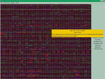
Another area where visualization is of high importance is when we consider data obtained from a microarray. A microarray can give us the expression of genes of a patient; in fact we use microarrays to obtain the expressions of genes for a set of human samples. Most of the times we know the medical status of the samples and use a microarray to obtain the gene expressions in order to apply some statistical methods on them in order to get results that can be of help for prediction. A visual representation of the information obtained from a microarray is shown in Figure 1. Rows represent genes and columns human samples. The value of each cell is the respective gene expression and the color (green/blue) shows whether the value is positive or negative while the scale of the color reflects the absolute value (the lighter the color, the greater the value).
Researchers use statistical analysis on the above data and obtain useful information. For example, they identify genes with similar behaviour. Furthermore, knowing the medical status of the samples concerning a specific disease, like cancer, one can identify genes with clearly different behavior (expression) in two cases: healthy or unhealthy tissue.
|
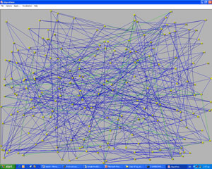
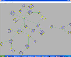
Another interesting problem is to visualize genes according to the relationship to each other, regarding a specific disease. This is done for a set of genes that are typical of a specific disease. In this case, a signal-to-noise procedure is usually used and a respective value is calculated for every gene. During this procedure the expressions of every gene are studied and a value of distinctness between the two categories is assigned to every gene. This method limits the number of genes by selecting only genes with high signal-to– noise score, ie, genes whose expressions can provide information. The next step is to determine genes with similar behavior. This can be done by calculating a correlation coefficient for every pair of genes and group sets of genes that are highly correlated. These groups of genes are shown together in a visual representation. Each gene is represented as a small circle and all the genes belonging to the same group are placed on the periphery of a large circle. Furthermore, we may assume that two genes are highly correlated if their correlation coefficient exceeds some threshold. We can visualize this high correlation by adding a line between two genes. Once again color can be used to show how high the correlation between two genes is. In order to have a clear and comprehensive representation we need to have an picture that is as clear as possible. In order to achieve this, special attention must be paid to the ordering of the genes that appear on the periphery of a circle.
Using this and some other aesthetic aspects we obtain the picture of Figure 3 from the graph (network) that is shown in Figure 2, where the nodes are placed randomly. The green lines join two genes that are not in the same group but are still highly correlated. This hidden information can be shown only using an effective visualization algorithm.
In conclusion we believe that the visual representation of biomedical information is very important. It allows researchers to visualize abstract entities and relationships between them, and understand much better specific functions, even hidden ones, that were previously unnoticed.
Please contact:
Ioannis G. Tollis, ICS-FORTH, Greece
Tel: +30 2810 391671
E-mail: tollis@ics.forth.gr