WWW Interface Design, Driven by Heuristic Evaluation:
The EINS-Web Project
|
S. Mangiaracina |
P.G. Marchetti |
|
Consiglio Nazionale delle Ricerche Area della Ricerca di Bologna |
European Space Agency — ESRIN Informatics Department |
|
mangiaracina@area.bo.cnr.it |
pmarchet@esrin.esa.it |
Abstract
This paper describes the experience of the evaluation and design of the EINS-Web user interface. EINS-Web allows the access to distributed collections of bibliographic and textual databases, together with a seamless interaction with the whole World Wide Web on Internet. The heuristic evaluation of the Graphical User Interface (GUI) was run in two steps. The results of the evaluation of the first version of the GUI were used to drive the design of the Web version. This paper describes the methodology used and the lessons learned. The interaction among evaluators and designers proved to improve the success of a spiral design methodology, which is needed to cope with the requirements of designing interfaces targeted at the rapidly evolving Internet world.
1. Introduction
Four different approaches can be used to perform GUI evaluation: formal (by means of technical analysis), automatic (by means of ad hoc software tools), empirical (by means of experiments together with user) and heuristic (judgments and opinions stated after the interaction with the GUI) [1]. We did select the latter methodology, because the heuristic evaluation is largely independent of the software and it is proactive, allowing picking up easily the suggestions and adopting them during the design and its review. During the EINS Web project we decided to drive the interface design by means of the heuristic evaluation, using a spiral design approach.
Heuristic evaluation is performed by looking at an interface and trying to come up with an opinion about what is good and bad about the interface. Ideally, people would conduct such evaluations according to certain rules, such as those listed in typical guideline documents. Most people perform their own "heuristic evaluation" on the basis of their intuition and common sense instead.
In order to evaluate a GUI that allows access to collections of bibliographical and textual databases, an information problem has to be formulated and opinions on how the interface supports the user throughout the satisfaction of his/her information needs have to be assessed.
2. The evaluation process
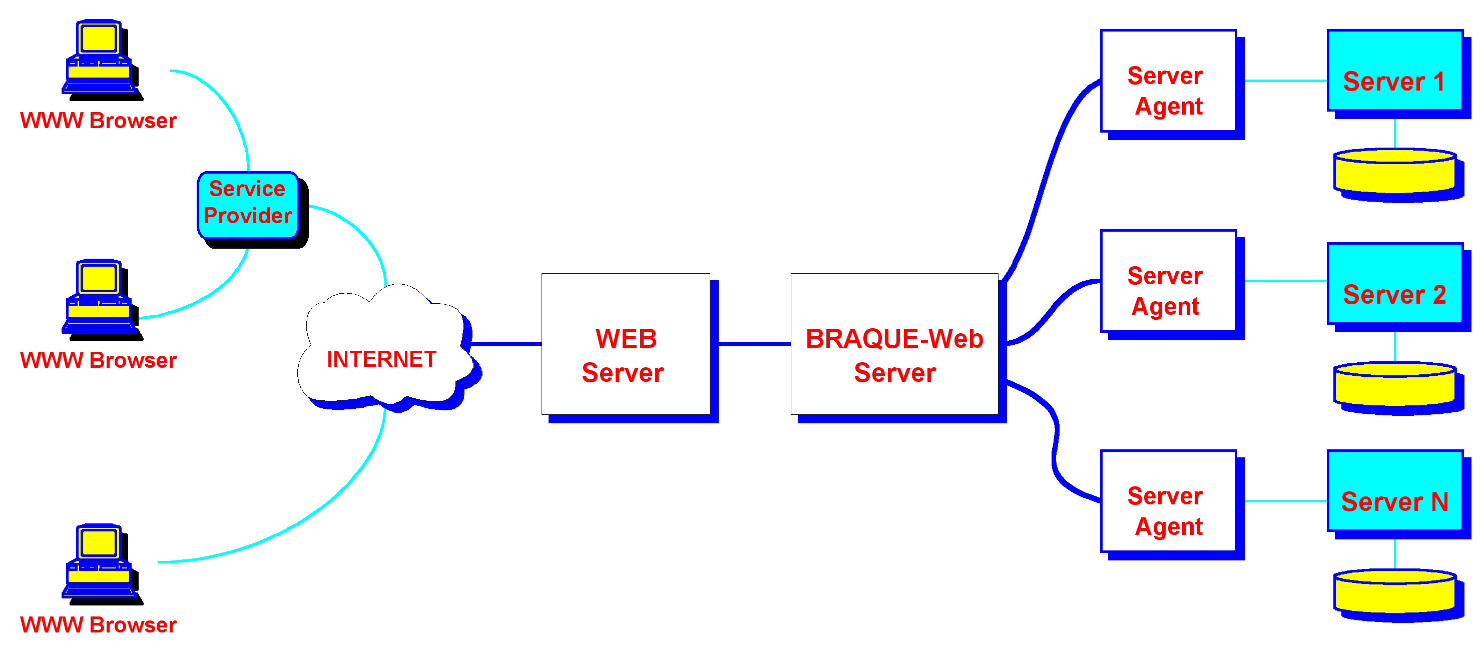
EINS-Web allows accessing distributed collections of bibliographic and textual databases, together with a seamless interaction with the whole World Wide Web on Internet (see Figure 1 for an overview of the architecture).
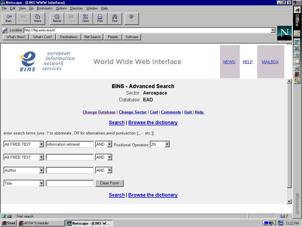 Figure 1 EINS Web Architecture
Figure 2 EINS-Web Advanced Search Form
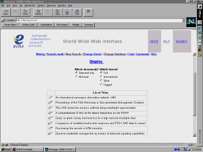 Figure 3 EINS-Web Title List Form
The evaluation of EINS-Web has been carried on in the
Library of the National Research Council (CNR) in Bologna (Italy), which was selected as the test site, involving several researchers of the CNR campus with their real information problems (in various fields, such as chemistry, material science, electronics, physics, geology, environment, etc...) and a mixed group of evaluators, composed by information specialists and experts in user interfaces.Figure 2 and 3 give an idea of the look and feel of EINS-Web GUI.
In the first step towards the construction of the EINS Web interface, we re used the design efforts for the development of the previous version of the interface (BRAQUE PC) (BRAQUE = BRowse And QUEry), developed for the Windows environment.
The design of the BRAQUE PC interface was initially based on an analysis of users’ information seeking behavior and Cognitive Task Analysis [2]. As a matter of fact, the information seeking strategies can identify a multiple dimensional space. This space is characterized by the information problem, by the nature of the information itself (e.g. information, meta-information), by the user’s goal (e.g. learn, select), by the information access method (e.g. browse, search) or by the information access mode (for example: recognize, specify). During the design process we understood that different information seeking behaviors were relying on common functional elements. We used the two basic functional elements: the browser and the searcher to cast the multidimensional space defined by the identified information seeking strategy [3]. The heuristic evaluation method was then evaluated and used to assess user satisfaction, ease of learning, ease of use, error prevention and efficiency of the interface and as a feedback tool to drive a spiral design process. Evaluator’s judgment was based on the nine heuristics from Nielsen (see Table 1) [4].
Any usability problem was fitted and analyzed against one of the nine criteria (see Table 2). A number of issues were detected, mainly of aesthetic nature. Some were serious, influencing heavily the interaction. Where possible, suitable solutions were identified. Sometimes solutions could be drawn from the nature of the problem itself.
The designers then revised the report produced by the evaluation team [5]. It came up that in some cases they were already aware of the presence of an interface problem, but did show that the implementation approach was lead by precise constraints from the underlying architecture. In most of the cases the developers agreed with the evaluators recognizing the usability problems. In one case only the disagreement could not be resolved.
For BRAQUE PC the designers used the classic desktop metaphor. A good management of buttons, windows and pull down menus together with a simple use of colors, makes simple and effective the objects' manipulation. The designers selected a task-oriented approach, associating different tasks to different environments (windows). In BRAQUE PC it is possible to interact with the databases either via the query language or via graphical objects. This possibility was considered very important, in fact it allows either to enter the commands in the query language or to interact with graphical tools (and eventually verifying the correspondence with the query language commands). Good also was considered the possibility to record on a file any operation executed (log file). This is especially useful for search results and queries.A new report was produced [6], putting together evaluators’ and designers’ replies, that served as "seed" to drive the design process for the World Wide Web version of BRAQUE. This new version was called EINS Web following the decision of the international EINS consortium that was going to exploit the interface.
The report provided a form containing the evaluation criteria and rules to be followed in the development of the new EINS-Web GUI. The EINS-Web heuristic evaluation form contains a suitable subset of the 101 usability heuristics as retrieved and analyzed from a database of 249 usability problems by Nielsen in [7]. The heuristics have been selected according to our judgment that they were likely to fully describe problems in the WEB interface and that they could be easily understood by different evaluators (see Table 3).
A second evaluation session was then run. Students of the Department of Computer Science of the University of Bologna, who had taken the one-year course in User Interface Design and Evaluation, carried on the evaluation in the Library of the CNR. Before arranging for the EINS-Web evaluation session, the students were given a training seminar on architecture and languages of information retrieval systems, which most of them had never previously used. The heuristic evaluation form (see Table 3) was then distributed to the evaluators and discussed with them. For each usability problem a separate column was given to be filled with a rating value: we agreed to assign values from 1 (the interface does not keep into consideration the usability problem at all) to 5 (the usability problem has been completely worked out). The evaluators were requested to identify potential usability problems and to tie each problem found to the specific heuristic it violated. As in the previous evaluation, multiple heuristics could be linked to any given violation. Finally, the evaluation session was carried on. The same evaluation, dealing with same information problems, was run by four different groups of students in parallel sessions. One group tested the interface using the Internet Explorer browser, while the others performed the evaluation using the Netscape browser.
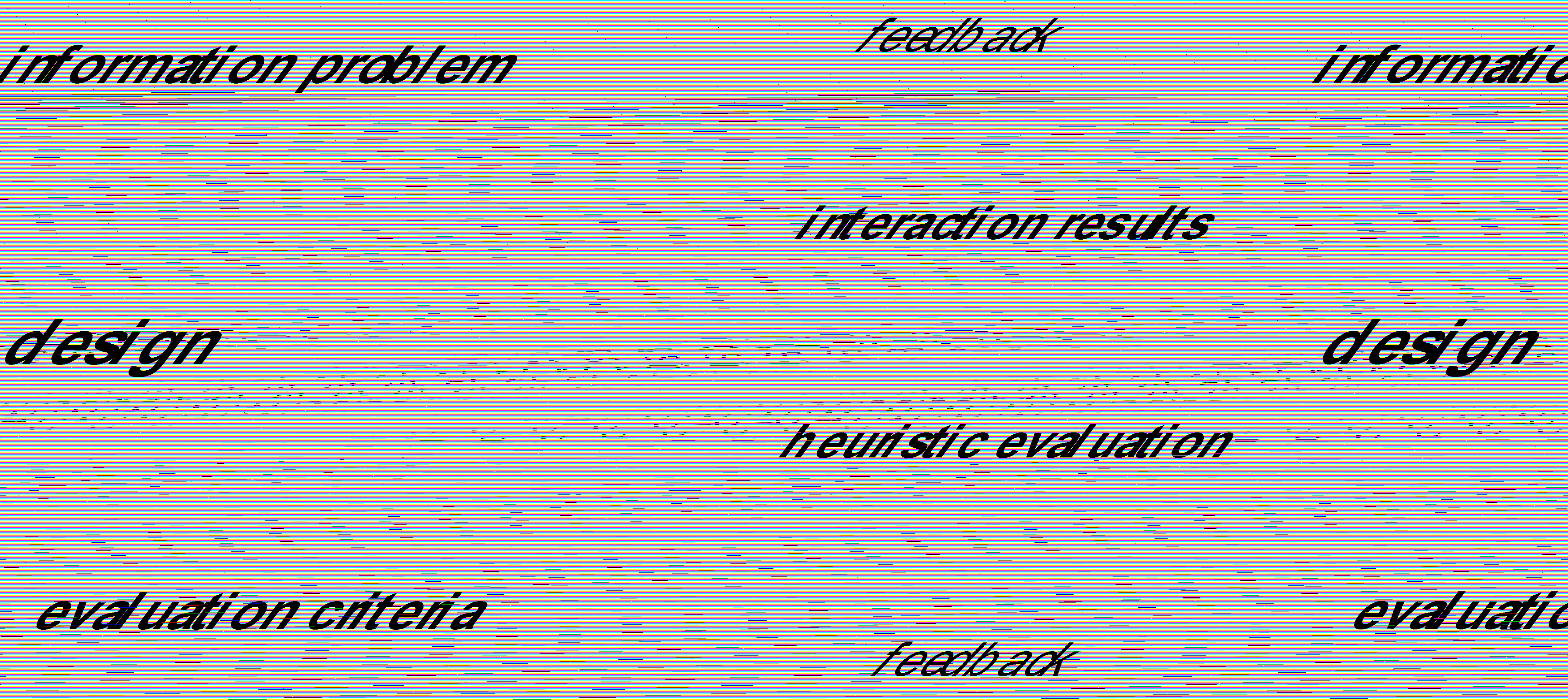
Figure 4
The feedback to the designers (see figure 4) allowed to modify the design during the implementation phase.
3. Lessons learned
Here is our assessment of the evaluation methodology:
Interface evaluation:
The second issue related to user background knowledge and user conceptual model. It was in fact recognized that EINS-Web should provide the same or improved functionality already present in EINS PC. The presence of a time-out resulted also very "annoying". Apparently it was not related to any particular user action or network error. Users get disconnected without notice or error message (or, after having waited for the result of a query, and having stopped the execution with the Browser’s STOP button, the system replied with the time-out disconnection message error). This actually happens because there are three different time-outs, not tied or synchronized to each other, that convey to the user the erroneous model of a "single wild time-out".
As preliminary conclusion we feel that the interaction among evaluators and designers proved to improve the success of the spiral design methodology depicted in figure 4, which is needed to cope with the requirements of designing interfaces targeted at the rapidly evolving Internet world.
Acknowledgments
We are indebted with Prof. Cesare Maioli of the
Department of Computer Science of the University of Bologna, and his students of the User Interface Design and Evaluation course, for the time and effort spent in the evaluation of EINS Web interface. CINECA designed the look and feel of the EINS Web interface as available to the EINS users at http://www.eins.org. The technical implementation was done by Vitrociset for the European Space Agency and the EINS consortium in the framework of the BRIDGE and CIME projects co-financed by the European Union.References
[1] Nielsen, J., Mack, R. L. Editors; Usability Inspection Methods, Wiley and Sons Inc. , 1994
[2] Belkin N., Marchetti P.G., Cool C. BRAQUE: Design of an Interface to Support User Interaction in Information Retrieval, Information Processing & Management, vol.29 n.3, 1993, pp.325-344
[3] Marchetti, P.G.; BRAQUE: A Hypertext-based Interface for Accessing Large Text Databases, Informatica e Diritto, Special Issue: on Hypertext and Hypermedia, vol. III (1994) - n.2 pp.10-112
[4] Nielsen J. and Molich R. Improving a Human-Computer Dialogue; CACM, 33 (3), March 1990, pp. 338-348
[5] Mangiaracina S. , Merivot. F., Statti F.; BRAQUE evaluation report, Technical Report: BRIDGE - IMPACT Project BIS-4017 10284/0 BRIDGE/WP3/EV/PGM/01/00
[6] Zappaterreno P., Marchetti P.G. BRAQUE-WEB Project. An heuristic evaluation guideline
Technical Report: BRIDGE - IMPACT Project BIS-4017 10284/0 - BRIDGE/WP3//HEG/PZ/01
[7] Nielsen, J. Enhancing the explanatory power of usability Heuristics; Proceedings ACM CHI’94 Conf., April 1994, pp.152-158
Table 1 Nielsen’s heuristic guidelines
|
Visibility of system status |
The system should always keep the user informed about what is going on by providing him or her with appropriate feedback within reasonable time. |
|
Match between system and the real world |
The dialogue should be expressed clearly in words, phrases, and concepts familiar to the user rather than in system-oriented terms. |
|
User control and freedom |
A system should never capture users in situations that have no visible escape. Users often choose system functions by mistake and will need a clearly marked "emergency exit" to leave the unwanted state without having to go through an extended dialogue. |
|
Consistency and standards |
Users should not have to wonder whether different words, situations, or actions mean the same thing. A particular system action - when appropriate - should always be achievable by one particular user action. Consistency also means coordination between subsystems and between major independent systems with common user population |
|
Helping users recognize, diagnose, and recover from errors |
Good error messages are defensive, precise, and constructive. Defensive error messages blame the problem on system deficiencies and never criticize the user. Precise error messages provide the user with exact information about the cause of the problem. Constructive error messages provide meaningful suggestions to the user about what to do next. |
|
Error prevention |
Even better than good messages is a careful design that prevents a problem from occurring in the first place |
|
Recognition rather than recall |
The user’s short-term memory is limited. The user should not have to remember information from one part of the dialogue to another. Instructions for use of the system should be visible or easily retrievable whenever appropriate. Complicated instructions should be simplified. |
|
Flexibility and efficiency of use |
The features that make a system easy to learn -such as verbose dialogues and few entry fields on each display - are often cumbersome to the experienced user. Clever shortcuts - unseen by the novice user - may often be included in a system such that the system caters to both inexperienced and experienced users. |
|
Aesthetic and minimalist design |
Simple things should be simple complex things should be possible. Things should look good, keep graphic design simple, and follow the graphic language of the interface without introducing arbitrary images to represent concepts. |
Table 2 BRAQUE PC evaluation results
|
Heuristic |
BRAQUE PC Evaluation |
Problems |
|
System status visibility |
Normally information on system status is available. Feedback is good, as well as overall direct object manipulation |
in some instances, when a task is activated, it is not possible to execute other operations. All that is not signaled. It is preferable, in such cases, to change mouse pointer into the hourglass.
|
|
Match of the system with real world |
The interaction is driven by the desktop metaphor. It is not necessary to know specific terms to use the system. Users must anyway know English language. In the Italian version most of interaction dialogues is in English |
In the Italian version most of the messages are in English. In some message box some of the text is in Italian some in English. We suggest to perform a coherent complete translation or to keep the original version.
|
|
Control and user freedom
|
User control of the GUI is good. It is possible to enable via the "edit" menu the "undo/redo" option for one level |
In the "Search Results" environment, it is not possible to cancel sets. If a large number of sets are available the user may be confused. If the cancel utility would be available it would be easier to organize the work and keep the environment under control. |
|
Coherence and standard
|
In general, the standard coherence rules of GUI have been followed. |
|
|
Error prevention |
Error prevention is good. It is based on a clear organization of interaction tools. |
If a file of type "Term Pool" is opened active window is canceled and replaced with the new archive. In such a way previous archive information is lost. The same is valid for the "Document Pool". In the latter case files are on disk and are not lost. However, is not possible to compare two Document Pools. |
|
Recognition instead than recall
|
Graphical tools offer options clear and self explanatory, it is not necessary to record the steps needed to perform a search |
It is not clear the method to be used to insert search keys in the "Document Searcher". The onscreen explanation is not exhaustive. The user has to remember the default operator inserted among the terms on the same line. The fact that a fixed logical AND links the four entry boxes for the search terms is a constraint for the resulting query |
|
Flexibility and use efficiency |
The separation of tasks allows a flexible and efficient use of the system |
|
|
Aesthetic characteristics and minimalist design |
The structure of the interaction tools, the colors' management, the small number of graphical objects are characteristics of the EINS interface, determining a nice looking interface |
|
|
User aids in recognize detect and correct mistakes |
Error messages are always clear |
When leaving EINS, the interface suggests to disconnect using the DISCONNECT command even if the command was already executed, and therefore not active |
Table 3 Heuristic evaluation form
|
Visibility of system status |
Score (1-5) |
Feedback: keep user informed about what goes on |
|
Provide status information |
|
Feedback: show that input has been received |
|
Features change as user carries out task |
|
Feedback provided for all actions |
|
Feedback timely and accurate |
|
Indicate progress in task performance |
|
Direct manipulation: visible objects, visible results |
|
Identity cues system response vs. user’s goal |
|
Show icons and other visual indicators |
|
WYSIWYG; do not hide features |
|
|
Match between system and the real world |
|
Speak the user’s language |
|
Contains familiar terms and natural language |
|
Metaphors from the real world |
|
Familiar user’s conceptual model |
|
Use of user’s background knowledge |
|
|
User control and freedom |
|
Undo e redo should be supported |
|
Obvious way to undo actions |
|
Forgiveness: make actions reversible |
|
Ability to undo prior commands |
|
Clearly marked exits |
|
Ability to re-order or cancel tasks |
|
Modeless interaction |
|
User control: allow user to initiate/control actions |
|
|
Consistency and standards |
|
Consistency: express same thing same way |
|
Consistency: same things look the same |
|
Uniform command syntax |
|
Conform to platform interface conventions |
|
Show similar inf. at same place on each screen |
|
|
Error prevention |
|
Prevent errors from occurring in the first place |
|
System designed to prevent errors |
|
What planning mistakes are most likely ? |
|
|
Recognition rather than recall |
|
See-and-point instead of remember-and-type |
|
Make the repertoire of available actions salient |
|
Seeing and pointing: objects and actions visible |
|
What features often missed and at what cost ? |
|
Provide list of choices and picking from list |
|
Minimise the user’s memory load |
|
Easy or difficult to perform (execute) tasks ? |
|
Allow access to operations from other applications |
|
Show icons and other visual indicators |
|
|
Flexibility and efficiency of use |
|
Shortcuts: Accelerators should be provided |
|
User tailorability to speed up frequent actions |
|
User interface should be customisable |